Monday, 4 February 2013

Radio Advert

The outcome of the Radio Advert:


This is the outcome of my radio advert after all the post-production that I could do on it. I am unsure of how I feel about it as it has been a new experience to me, so I know that there are areas that I could improve upon greatly, but also the fact that I have managed to complete it to a level that is slightly respectable. 

The aspect that I am not pleased with is the dialogue of the actors as I didn't realise during recording how rushed and stilted the conversation seemed, but perhaps I am being a little too self critical.I do think that it gets the message across and the scripted play puts the audience in the actors situation and makes them able to relate to the scenario. 

I like the choice of music in the middle of the radio advert as it is uplifting, vibrant and up-beat, all the things that could portray a newspaper in a positive way.

I know know how to use the software so I am pleased that this experience has taught me something new and is a skill that I could use again in the future.

Wednesday, 30 January 2013

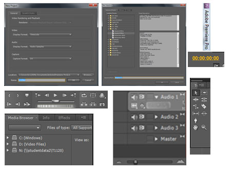
Using Adode Premier

I used software for editing the radio advert...


After I had completed my recording for my radio advert, I knew that I needed to edit the raw data that I had collected in order to make it seem a little more professional for a radio advert, yet I knew that I would have to take it slowly at the beginning and get used to the software.

I began by spreading the clips of recordings in to a continuous run, on several audio tracks,  so that I could easily adjust and see how my radio was progressing and where it wasn't as fluid or didn't make sense.

I then began to adjust the volume of the audio so that there was a constant level of noise through out and made it easy listening.

I realised at this stage that I did not record a male voice for a the information part of the script and radio advert. This is what I spent the next lesson doing. I used an actor called Daniel Kitson and he was able to produce a low voice,which contrasted well with the higher pitches of the women. His also came across confident and lively, exactly what I wanted from him. I was able to easily slot his recordings in to my existing radio advert, due to the easy editablitly of the software, Adobe Premier.

I began to introduce the audio transitions such as 'CONSTANT GAIN' and 'FADE' and this meant that there were slight breaks and levels in the 30 second advert.

I knew that, being a radio advert, the audience would have been listening to music, So having a small amount of music time meant that it would stand out from the rest of the features being played on a radio station. However, I introduced a slight bit of music during the men's vocals so that it was clear that he wasn't involved during the women's scene, until I wanted to introduce him.

Choosing the music was quite time consuming as I used an MP3 file that already existed in the Music Library, rather than find and download one from the Internet. I did this because I felt that finding and downloading would not only be time consuming, I would feel like i would only download recognisable songs, this is not what I wanted as the focus would deviate from the script. I was considering between the first 7 seconds of The Beatles 'Come Together' as there is a strong beat but is not instantly recognisable in those seconds and an easy listening melody, which was lively and upbeat and strong, like the voice actor himself.

I chose the easy listening melody as I felt that it suited the newspapers image and created a more fun and vibrant personality to the brand of the newspaper, whilst the tones also contrasted well with the deep tones of the actors voice.

Overall, I am happy with this software and how easy it is to cut or add pieces to the running time of the advert and although I still need to master some tools in it, I feel that I have created a successful advert for my newspaper.

Thursday, 24 January 2013

Creating the Radio Avert

I was a little nervous going into create the radio advert in the college recording studio...


I have never been very skilled in technology, I've often been very clumsy and make mistakes, so going into the new recording studio, with equipment that I have never seen - let alone used - before, I knew that there was a learning curve to the process of recording, editing and exporting my data.

   After a quick tutorial from a Media tutor, I knew I had that basic knowledge of the equipment, such as an Apple Mac, Audacity and the recording set-up and decided to begin my recordings.

I used my own voice for character 'Woman 2' and used a female actor for 'Woman 1' and this would give me a variety of tones and distinctive voices for the radio advert, yet both still had a local accent. My voice is quite high pitched, yet quite soft and the actors voice was of a deeper tone, yet her words were often emphasised by a several loud, high notes.


It took a few takes to get a fluent recording but after 20 minutes, I got to a stage where I was happy with the recording and script. The only issue I had was that, on hindsight, I should of recorded each line separately so that there were slight pauses in between the speeches, as it seems as if we rushed the conversation.

Overall, the experience was very educational and I feel that I would be able to do it again in future with out any problems.

The next stage that I need to take editing this piece of recording into making it a radio advert and this would be using another software that I had never used before either, so again, I will have to learn on my feet for this.

Thursday, 17 January 2013

Radio Script Ideas

Writing the script...

 
I was at the stage where I felt that I needed to jot ideas and plans for a script before I lost any motivation. My ideas were as follows:
 
  1. Have a scene of a building site, where there are 2 builders e.g. a slightly dumb and naive one and a sensible, reliable builder. This was to represent the other newspapers being 'dumbed-down' compared to the reliable and trustworthy paper such as mine. The main idea behind this was to have the dumb builder -call him Builder 1- reading a newspaper, where he would go onto believe and retell a bizarre story that is featured within the paper. Thus making the sensible reader -Builder 2- exclaim in frustration at the stupidity of the newspaper and that Builder 1 should get a new reading source -preferably Tlydesley Today.
      2. My second idea was largely based around the first idea, involving 2 characters where one is less gullible than the other. Yet, this time involving females, I did this to fit in with the stereotype of women having a lower IQ and are more gullible than perhaps men.This time, I felt that the scene would be good in a shopping centre with all the ambient sound available, however, I felt that it would have been hard to determine in a radio advert.
 
      3. Developing on from my second idea, I thought that the most recognisable place with sound effects would be either the city or the country i.e. park. When I began to listen to the sounds of a city, it could have been very over-powering for the audio of the voices, so I went on to choose the park setting as a scene for my radio advert.


Developing and writing the script:
 
(Scene setting: PARK - Faint whistle of wind, children's laughter and talk, Birds chirping, dog faintly barking in the distance? Rusty Playground equipment?)
 
Woman 1: (Rustle of paper) *amazed * Hey, have you seen this?
 
Woman 2: *patient but slightly patronising * No, whats it this time?
 
Woman 1: Well, it says here that there was aliens spotted on the top of astley brew last night...
 
Woman 2: *Amazed at her naivety * What? And you believe this?!?
 
Woman 1: Yeah, it says that there were three of them spotted by one local lad!
 
Woman 2: I think you need a new paper love. I get Tyldesley Today. Look, I can even get it on my mobile...

Mans Voice?: *Broad, Confident * Tyldesley Today. Local News YOU Can Believe In.
 
                        *Pants i.e from running * Ladies... (as a way of acknowledgement and greeting.)
 
Woman 2: *Flustered and appreciative*  Phew, he might not be an alien, but he sure is out of this world!!!!


This is the finalised script that I have chosen as I feel that it would attract a listener for a number of reasons, such as: Having a continuous script creates a drama and is similar to a radio play, which encourages the audience to carry on listening. Also, there is characters that alot of people could relate to and the friendship shown in the pair. Making it easy to relate to meant that it can attract and audience and make the brand - this case Tyldesley Today - seem more friendly and trustworthy, like a friendship between two people. It also has a slight addition of humour to the script, but not outright jokes where the jokes could over-look the required information about the newspaper, but just enough for an audience member to remember the quirky details and link it back to the name of Tyldesley Today.
 
 
Overall, I am pleased with the script that I have produced, however, I feel like it is a open script which I can easily change and adapt when recording, to make it flow more easily etc.

Friday, 4 January 2013

Final Poster Creation

This was it...

 The image above is what I considered to be the final outcome but after revising it, I made changes to create the final outcome below.
I made the background a little whiter for a cleaner and more professional look as well as adjusting the text at the bottom of the page to make it more dominating and less confusing to read. I also adjusted the layout of the social networking links to make them more subtle in the overall page.

Overall, I am happy with the poster that I had created as I feel that I have been able to realise the my errors and correct them to the best of my ability, as well as creating a poster that could be presented across a wide variety of media's e.g billboard, printed etc.

Monday, 24 December 2012

Poster Creation 2

Second Attempt at a poster...


After the first attempt at  poster was pretty poor, I conducted a shoot on stacks of newspapers as I thought of a question to be 'Does Your paper deliver the truth?. This would directly address the viewer/reader and make them question whether their current newspaper was trustworthy.
  This would tie in with my newspapers tag line of 'Local News you can believe in...' and make the viewer/reader of the poster want to go out and buy or subscribe to 'Tyldesley Today'.

I really liked an image where all the newspapers were spread and layered on top of one another, creating horizontal lines across the photograph. However, when I placed this image within my own format of a poster, it became clustered and hard to focus on the text that I wanted to put across. I.e.My newspaper name etc.

It didn't seem to be working as well as I thought...

Wednesday, 19 December 2012

Poster Creation

I thought that after I completed my front cover, the poster would be the next relevant stage in the process of creating my coursework.


My initial intentions for the poster were that there would be a newspaper open to a page were all the text were saying positive words like 'Honest. News. Local' etc.
   I collected my source for this by printing out a sheet of these words and photographing that at different angles but when I began to edit them, I soon realised that the quality of the lighting wasn't good enough to be large scale.
   I tried to over come this by making the page seem more clip-art (by brightening the page to a white as well as painting over the original text) and I felt that it contrast well against the black background that I had allocated yet it began to look to unprofessional and amateur and not resemble an actual newspaper.
This was as far as I attempted after losing motivation over the look and style of the newspaper that is featured within the poster. As you can see, I tried to make the key words in the poster LOCAL stand out in red, which also ties in with my other theme.


    It was nearing the end of the editing phase when I re-looked at my edited pages and despised them. I thought that they looked over edited and more like a clip-art image than any newspaper.


This caused me to rethink my designs for the poster and to conduct another shoot...

Tuesday, 11 December 2012

Poster Research

After completing my newspaper, even though I know I can edit it at any stage, i can start my poster.


I feel that this is is a stage of my coursework that I can be comfortable with and I anticipate that the only aspect that would be to my disadvantage would be my technical skills using Photoshop as I feel that the outcome would look quite amateur, as I have never created a poster before in it and it would be a learning curve for me.

I found it hard to conduct some research for a poster advertising my new local paper, as I couldn't find many examples, other than other students previous work.

 This is an image of an advertising campaign set in Africa: 
The Zimbabwean Newspaper: Trillion Dollar Poster, The Zimbabwean Newspaper, Tbwa\hunt\lascaris, Print, Outdoor, Ads

The basic meaning behind the poster is using the money as a background as the newspaper is trying to  illustrate Zimbabwe's economical situation under President Mugabe.

After unsuccessfully finding professional poster adverts for local newspapers, I have decided to research several type of posters, e.g. billboard. As this will hopefully give me some sort of idea of presentation.


This poster is for a television station and the image correlates to the text i.e 'Nothing Gets You Closer' and a close-up photograph. It contains the channel name, show the type of station and contains a hash-tag so viewers can interact and connect via twitter.

I believe that this is a campaign for publicising London Taxis and it is a vivid colour and definitely attracts the eye.
I personally don't quite grasp the concept of the illustration but I can see that it it relates to some sort of map and thus, makes it relevant to a taxi firm.

I have noticed in both of these posters that the text is bold and blocked in colour and this is definitely something that I could pass on into my own poster at some stage.

Friday, 7 December 2012

Finished Newspaper

This is my finished newspaper (albeit the first Two pages - Front cover and Page 2)


I am pleased with the outcome of my newspaper pages as I feel that the time and effort that I have placed into it shows how I have developed from my research and ideas as I went along with the production.

The only thing that I felt is a little overlooked is the colour scheme as it is very similar to the outcome of my AS media coursework of the Music Magazine as I have focused strongly on the Reds, Blacks and whites. This is because I feel that they are colours that don't have a dominant stereotypical view format on them i.e. Blue is considered masculine and pink is classed as feminine. The red and black are formal, unisex and professional yet are still colourful and vivid if the right tone red is used. However, in this unit I have added blue to create a more formal, inviting look and when I have placed it next to the other colours, it looses it connotations to it (masculine) and becomes more of an additional key tone and adds another feature to look at.

A feature that I like is the light grey box behind the column stories. I think that it ties the whole page together and that without it, the front cover would seem too full of text and have no balance. It separates the page into readable sections and yet, make all the pieces of information link together and fit on the page, without clustering.

Throughout the process of creating the front cover, I had to constantly develop and restructure my ideas as when I was planning the layout of my cover, I didn't think of text formats, advert size etc. So all these things had to be taken into account whilst I was creating my page and was easy to re-edit due to the Microsoft Publishing Software.

This is my second page and I feel that it is as strong as the front one and I have kept the colour scheme and format of the layout. By this, I mean that I have tried to put a frame with the side column of stories but, on the second page, I have added contact details for the newspaper and how the readers can keep in touch. I changed the scaling of the adverts to create a page that is a little more unbalanced and I think that this is a recognisable difference from the front cover, creating a diverse page.

I wanted the images on this page not just to be showing the identity of the 'missing teens' but also a visual guide for viewers to judge distance and location etc. The image of the teen couple is also showing a personal relationship, unlike the mug shot on the front cover.
 

Wednesday, 5 December 2012

Steps of progress

What Process I took...


These are image and screen shots of me demonstrating the basic steps of creating the newspaper 'Tyldesley Today'. However, I did alot of different changes along the way and documenting them all would be too long, so, these screen shots are the showing how I progressed through each page after I had finished. Along the way, I have had to create a variety of improvements and changes that I wouldn't have originally thought of or planned.


 After I revised my story (look at the previous post to see where I started) I created a template using Microsoft Publisher margins and adjusted them until I felt that there was a balance between the amount of text and the images.
I started to present my work by using the masthead as a guideline - as it is the most important feature of the newspaper, I placed this on the page where I felt that it would be the most commanding and I started to place the rest of the text around it, supporting it. The adverts were pretty straight forward as I wanted them presented in a uniformed and straight position. I put the picture of the 'criminal' almost in the middle as I wanted it to attract the eye to the the main story. 
 I then proceeded to place additional amounts of texts and images within the margin boundaries. I decided to position the second image on the opposite side of the page for aesthetics, but also for the idea that the two people shown have 2 completely different and opposite cultures,judgements and ideas. At this stage, I adjusted some of the text of the info-graphics and the slogan from 'the TYPE to believe in..' to 'Local News You Can Believe In...' as I felt that was more easy to relate to in the community. 
 This is the finished front cover page.I put the column with a pale grey background as I wanted to break-up the page a little bit and section it into readable chunks...


I started on the second page in a similar way to starting the first page - by creating the margins and using it as a template. However, I wanted there to be a slight difference in the format from the first page, so I made the main images uniformed and straight and the adverts of different scaling, unlike the features on the front page.

This was the finished result of the second page and it basically just spell-checked it and proof-read it several times.


Saturday, 3 November 2012

The start

Time to begin the cover...


I thought that it was about time that I started my front cover and I used my layout idea from my research to create a template on Microsoft Publisher.
Already, I have found problems with my design that need to be improved instantly, like the masthead did not include the date of the publishing, so I went back to my research of the 'Leigh Journal' and adapted their version of it, by having it underneath the actual masthead and in a different colour so that it would break up the page and stand out.

The next step was to add some graphic adverts, although I knew I wanted to save most of these for the second page. I think that the red information box works well here. The initial text in this box read; 'Something Intriguing You?' but I felt that this was a little too long winded for the size and shape of the box, so I re-edited it to say; 'Want Some More?'. I think that this gets straight to the point in a small amount of words and causes the reader to read on.

I looked back on my blog posts to my story page to re-inspire me over the lead story and I felt that it was more natural to me to write as I type along and it flowed alittle better, using a computer with the Publishing software makes it easy for me to re-type or re-style my newspaper if need be. This is actually what happened. I wrote too much for the lead story and I had the ability to adapt and delete sections until I was happy with the story that I was representing.

Tuesday, 30 October 2012

Story Ideas

Because I am a visual student i.e. I take 2 arts, I decided to create a mood board/visual board to represent possible stories.


 community

 Competition/Food

 Crime

Health

 Education

These are just basic illustrations of the possible stories that I could feature within my newspaper, I used the software of 'Paint' as it was quick and easy to use.I did not intend these images to be aesthetically pleasing, they were just a quick illustration sketch and I think that they do they job. 
   I have decided to focus my main cover story on crime as I feel that it would be easier to capture a mug-shot looking image.

Thursday, 25 October 2012

Final Adverts

After I created my first attempt at an advert, I decided to do a cluster of them so that I had the choice of using many for the newspaper.


This was the next advert I created and I got the inspiration from my research for photoshoots and I like the simplicity of the advert I saw yet it contained an image and colour. I think that this is a fair advert but definitely on review could do with some improvements i.e getting the lines of the coins more horizontal. I think a good aspect of it is the reflections as it adds another dimension to the advert, aswell as something else to look at and study.

 In this advert I wanted to create a advert for a furniture store and I wanted it to be quite updated and modern and I think that the background, aswell as the font and colour scheme - which I toned in with the cushion of the chair-  achieve this as it creates a rememberable logo and recognisable style for the store. I liked the detail in the chairs wood and wanted the main focus to be on this so it shows that the furniture store contains traditional furniture yet could be presented in a modern, 21st century way.

 I realised that I had no food/grocery related adverts yet so I intended to create a bakery advert that was quite fun and charming. I think that my favourite aspect of this advert is the words being illustrated on a cake with cream and candles and cherries which I created in photoshop. The examples of photographs that I created make the readers eyes look around the advert, whilst the strong text reports all the relevant information. The only problem that I could face with this advert is that the colours could jeopardise the quality of the advert if the newspaper was to be printed or viewed in a way that I haven't seem or experimented with. By this I mean that, I have no idea on how the adverts colours would look once printed and whether it would effect the quality of the text.


I think that this could potentially be my weakest advert as I didn't spend alot of time focusing on the aesthetics of the advert but rather the edit of the image to create a old, vintage-styled Polaroid to link in with the theme. However, I feel that this advert could be related to a amateur business man that created an advert just to present in his/her local paper, instead of a highly qualified professional graphic designer.

Overall, I feel that I have created a good selection of adverts to use in my future newspaper and they showcase a variety of business that could be found in the local area, thus, making them relatable to potential readers. For all of these adverts, I used Photoshop.

Friday, 19 October 2012

Graphic Adverts

I want a balance...


By this, I mean I want a balance between adverts that contain images and pictures to one that include just the graphics.

This is the first advert that I have tried and I think that it has both successful points and weakness'. I think my favourite aspect of it is the silhouettes of the pets and the person as it is easily recognisable and adds images to the image without over-powering the information. I think that the coupon could be the downfall of the advert as if it was scaled down to the size required for an advert, the coupon COULD be too small to read or cut out etc.

Wednesday, 17 October 2012

Inspiration For Photoshoot For Adverts

Almost time to pick up the camera...


This first section is an advertisement for jewellery and using these professional adverts as my sources of inspiration.


I think that this advert is very elegant and feminine. The focus -of course- is on the rings but I think that the patterns on either side make it more interesting to the eye and it the lines flow through the wide shot.
 

This isn't as elegant as the previous one as it uses harsher colours but I think that this is one that would stand out more on the newspaper page because of the contrast between colours. I also don't understand the graphic of the horse but I presume that it is related to more of the owners and business than the specific jewellery. It contains enough information for the business to be found so it can be classed as successful.
 
I then looked at financial adverts for loans etc.
 
I definitely like the simplicity of the two white advertisements. It uses just one colour to attract the eye of a viewers and although the photographs are simple and don't tell much individually, when they are placed next to a text, you can see the link and understand them more.
 
If i see anything else during the photoshoot, I can easily find the inspiration from them and shoot them with this type of research.

Tuesday, 16 October 2012

Advert Research

I am not usually a fan of looking at adverts in a newspaper...


In order to find inspiration for my adverts, I have decided to look at professional ones that are displayed in newspapers around the country.

This is an advert for a pub and I think that the design and layout is good but to me the colours don't represent the pub as well. I think that there is nothing that definitely stands out from the page as the colours are too vivid as individual colours and do not really compliment one another in the size that the advert would be.
 
 
I was unsure whether there was any difference between normal advertisements and one that are placed within a local newspaper, so, my following research is looking at adverts place in the Leigh Journal. My local Newspaper.


I think that this advert is both basic yet has alot of information on it to offer. I think that the setting of the models are there to represent their personalties and what would appeal to certain audiences e.g. The woman is sat on an elegantly crean chaise lounge and has ornate furinture in the set - this makes the woman seem instantly of a wealthier class and this would appeal to many females, to aspire to be her. The male model on the other hand is in the outdoors and this makes him seem adventureous and sporty, thus appealing to men. It can be seen as quite stereotypical but is so subtle that it doesnt cause any offense to the viewers. The colours of the adverts seem to tie in with the image aswell i.e The females top (and most importantly shoes) and furniture, aswell as the man dark clothing can blend in with the dark blue and ivory colour scheme.
 
This is an advert for a restaruant and I think that it tries to illustrate the decor of the restraunt the most, which I first found quite unusual as I was expecting to see images of their food or chefs. However, the image does link in with the text 'Contemporary Indian Restraunt' and this can mean both modern indian food aswell as the interior. I think that the colour choice is wise as the reds keep in theme with their own logo whilst the blues help the highlighted texts stand out and catch the eye of a viewer...


This is an advert for a fireplace company and obviously the main focus of the advert is the new fireplaces, so it contains alot of photographs on it, yet displays them in a formatted and uniform structure -which I find to be the most professional looking. The colour scheme ties in with the idea of a 'fire' with the ambers and orange tones and they contrast well with both the white and the black aspects of the infographics.
 
I find that this is an advert that you would most likely expect to see within your local newspaper, largely down to the unprofessionally shot image of the store. I think that the best feature of the advert is the sizing of the door on the left hand space as it takes up half of that area and instantly attracts the eye towards it. The company has stuck to the 3-colour rule yet I feel that it wouldn't have downgraded them if they included another colour in order to brighten things up.

This is what I consider to be the brightest advert out of them all that I have reserached and the reason and idea behind this was to choose autumn colours - ambers, browns, greens and yellows- to emphaises and make the viewers instantly recognise the season for the sale. I feel that this is one of the most successful adverts as I believe that the sizing of the texts and image work well with one another and there is alot of inormation on the page, yet it has still got enough space to display backgrounds etc.


I was surprised to see that this image was in black/white but as I thought about it more, I knew that it made sense to do it this way. This advert in particular was full-scale towards the page and in the long run, it would be more cost efficeient for the image to be in this greyscale as then it would be easier to reproduce. I like how you can instantly tell the subject of the advert and the information is easy to see (except the small print like the Terms and Conditions etc) and the sticker labels help distinguish the most important information that the company is trying to get across.


I think that this advert is one of my favourites in what I researched. It plays on the stereotypical views on cleaning on the sexist view that it is a woman chore - using the stereotypical colour of pink and a bleach blonde woman in a small black dress. I think that the fonts used make the advert more eye-ctaching and lively and delievers the information straight away. The contact details are obvious to the veiwer and I think that overall it is a very successful advert.


From the research that I have just conducted, I can see that colours and scaling are highly important in showing off images and objects. I could proceed to do adverts with both photographs and without and yet could both be easily successful.
 
I also prefer to have the advert jam-packed with information rather than just using a basic lay-out and this is also supported by my previous questionnaire using the question of:
 
Do you prefer to see adverts that….?

Attract your eye with colours.
Have good information to offer
That have a simple, clean layout
That are mainly pictures
 
With the majority of the feedback being that the audience prefer to see mainly pictures and images, I shall create several pieces that include just this type of information.


Wednesday, 10 October 2012

Advert Audience

I feel that my next stage to do is perhaps the adverts...


I think that it is something that will take up time but isn't necessarily the most important aspect of the newspaper.

However, I feel that adverts should relate to the readers and on order to gain more of an insight into the target audience, I shall conduct a questionnaire that gives me information and likes/dislikes of the community, their own taste etc.

The example of my questionnaire is below and it is a simple multiple choice one that gives me information the quickest. I perhaps should have done an open answer questionnaire, as this would give true opinionated results, however, I felt that this would have taken up too much time to gather the results and to put a common theme among them in order to create stories and adverts that would appeal to everyone.
I shall hand this to Winstanley College students, as well as Tyldesley locals as well as a online survey as I feel that these would give me the best overall opinion related to newspapers.


Questionnaire

Do you read your Local Newspaper?

Yes

No

Sometimes


Do you look/read the adverts?


Yes, if they concern me or my interests.

No, They don’t usually concern me.

Sometime, but only if they catch my eye


What would you consider paying for a newspaper?


I would want it free

Less than 50p

More than 50p


What do you feel is the least important thing for you to read?

Crime news in the area

About Local Businesses and Schools

The advertising Pages

Other ……………………………………………………………………………………


What writing style do you prefer?


Informative Writing

Friendly Writing

Minimum Words Possible

Lively, Confident yet Informative


Do you use your local facilities?

Yes

No

                       
Do you enter competitions?


Yes, (e.g. If the prize is worth while.)

No, (e.g. If they cost money to enter)

Other………………………………………………………..


Do you prefer to see adverts that….?


Attract your eye with colours.

Have good information to offer

That have a simple, clean layout

That are mainly pictures


Are You male or Female?

Female

Male

Prefer Not to say


How often would you want to get a newspaper (e.g delivered)?


Everyday

Every week

Every 2 weeks

Once a Month

Whenever I would collect it at a shop


What type of information appeals most to you?


Entertainment

Sports

Television/Radio

Real life/ local news

Politics


From my research, I have put the most important answers into a graph, so they easily illustrate the results, I think even though I have shown only a few questions in this format, it shows me what I need to focus on and what the audience would like - plus, I have kept all of the results from the questionnaire is I need to refer back to them at a later stage.


 I have used Microsoft Excel to create these graphs and Microsoft Word to create the questionnaire, the reason why I have not created an online survey was because i felt that not alot of people would take time out to complete it, where as if I handed it to them, there is a higher chance that it would be completed successfully.

Friday, 5 October 2012

Final Name

I have finally managed to choose a name for my local newspaper...


I have decided to use the title of 'Tyldesley Today' as I like the alliteration of it and I think that it gives the impression that Tyldesley has come along way from its deep history and emphasises the change that has happened over the years.

Tyldesley Today

I decided not to use 'bongs' as the area name as it can have connotations for it and I am not familiar enough with Winstanley to do a local newspaper about it.


I decided to take inspiration from the likes of 'The Times' 'The Independent' 'Daily Mail' from their Mastheads as I felt that they seemed low-key yet emphasised a professional establishment.


I have decided to 'colour-pop' the red in the coat of arms as I felt that it could tie in with a potential 3-colour scheme as well as making the title more visually enticing and eye catching. I decided to do alot of varieties so that I could see possible outcomes but after creating this many, I have found it difficult to choose which one I prefer. In order to solve this, I have printed out the possible option and handed them out to a potential target audience.

They have had to decided which they initially prefer as a masthead for the newspaper that I am designing.

The one in which came to be the majority vote was the 4th one on the list. I wasn't really expecting this result but I am pleased that there has been an outcome from doing this distribution of a 'questionnaire' as I can truly say that its what the 'readers' would want as a masthead.

Tuesday, 2 October 2012

Newspaper Names

From looking at the local newspapers, I can see that it is important to include the name of the area e.g. Leigh journal. Here is a list of possible names for the local newspaper:


Tyldesley Times
Tyldesley Tabloid
Tyldesley Today
Tyldesley Telegraph
Tyldesley Tribune

Tyldesley Chronicle
Tyldesley Courier
Tyldesley Union

(Tyldesley Used to be a mining town so to link in with the history I could use names such as; The Miners Mind, The Miner and News etc.)

Tyldesley is also known as 'Bongs' as it used to be called 'Tyldesley Banks' thus called 'Banks' then through local dialogue developed into 'Bongs' so I could also use this name; 
Bongs Bulletin
Bongs Brief
Bongs Banner
Bongs Watch
Bongs Acorn
Bongs Advance
Bongs Appeal
Bongs Echo etc

Winstanley Wire
Winstanley Word
Winstanley World
Winstanley Week

I cant just go with a name that sounds the best as I have adverts to do for it (both poster and radio commercials) so there needs to be a motto/slogan that ties into the name.

Ideas for Motto's/Slogans:

When the News Breaks, We Will Fix It.
We have Issues...

On the Tyldesley Crest is the motto of 'regis et patriae tantum valet amor' which I believed to be the motto of a battle that Sir Tyldelsey fought in and I could use a translation of this.The Tydesley High School Motto is Facta Non Verba- which translates to 'Deeds, Not Words'. I could re-adjust this to say 'We write the words, you do the deeds' etc to link in with the fact that it is a newspaper.

I have alot of decisions to make...